top of page
Concept 1
Delta Dental
Shopping 2.0
Role - Lead Product Designer
Team - (me) Product Design Lead, Sr. Product Designer, (2) Content strategists, Lead Developer and PM
Scope - Design the next generation shopping experience for Delta Dental insurance plans.
Duration - 6 months
Skills used - Design thinking, Journey mapping, user research, information architecture, wire frames, user flow, visual design
Tools - Sketch, Invision
Learn
Problem and Task Analysis - Users were dropping off during the shopping phase of the Delta Dental experience. During work shops users indicated their general lack of trust when it comes to insurance. How can we build trust amongst users who shop for dental insurance. An improvement in the conversion rate would be our measure for success. The data tells us that we would need to -
1. Improve our transparency
2. Educate our users
3. Hold the users hand
Ideate - The first step was to evaluate workshop ideations from the team. A correlating factor emerged from the storyboards. They all presented the user with a plan recommendation. This would serve as the solution to #3 in our design strategy - "hold our users hands".


The next step was to determine what questions would we need to ask users in order to make a successful recommendation. The recommendation would be based off the users personal and oral care data. We would also use this to create the hierarchy for the flow.


We designed for two primary personas / used cases.
1. User that don't have a general understanding of insurance will need or want a recommendation.
2. User that have a basic or advanced understanding of insurance will just want to see the plans.
We built logic into the flow as a recommendation engine. This flow routes users depending on their oral care frequency, need for basic or none basic care, price sensitivity and wether they want to keep or not keep their dentist.

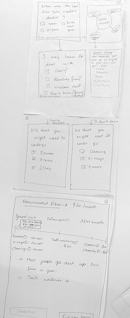
More ideation. Now that we had a clear design and direction we chose to come up with as many concepts as possible, just to make sure we were not missing out on anything outside the box. Below is 4 out of the 10 concepts.


Concept 2


Concept 3


Concept 4


In the end, the shopping experience would be comprised of 3 parts. A questionnaire, a recommendation and a plan comparison. We came up with a series of 6 questions to guide the user to a recommended plan. The first version had a dentist finder as it was important for users to keep their dentist. The example below displays just 1 question.
Version 1 - first pass


The evolution of the plan recommendation experience. Why are we making it? Visibility of Benefits and When are the benefits available?
Iteration 1
Iteration 1
.png)
Iteration 2

Iteration 3

Iteration 4

Iteration 5

The evolution of the compare plans experience. In the end it was most important for users to be able to compare all plans side by side. This became a challenge being that our real-estate was 320px wide. Below is just 3 out of many explored compare plans experiences, each of which went through the fire of both team critique and moderated user testing.


Iteration 2

Iteration 3

Iteration 4


Iteration 5


We designed responsive for the lowest common denominator (iPhone 5) 320px. The final outcome was tried, tested and proven throughout a 5 month design cycle of rigorous moderated and unmoderated user and usability testing.


 f'real FoodsRetailer App UX / UI |  Delta DentalShopping 2.0 UX / UI |  CiscoCollaboration Help Portal |
|---|---|---|
 Capital OneMobile down load sprint. |  viewpointDocument viewing tool redesign sprint |
bottom of page